Justification
Justification of typewriter copy is one of those lost arts. In spite of nearly all typewriters being monospaced (all characters occupying the same width), heroic fen managed to achieve something like typeset justification in their text.
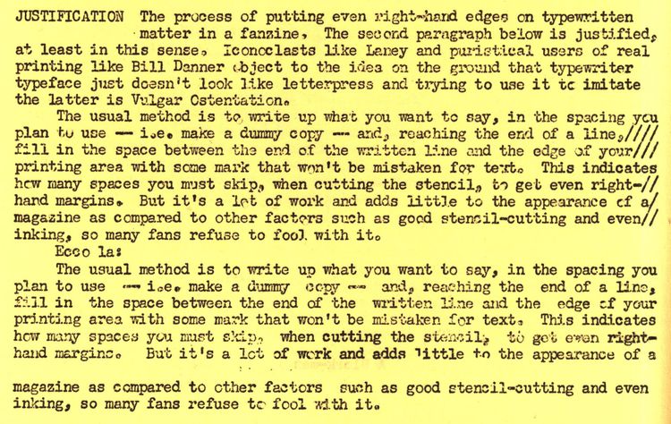
The details of the process are simple enough, but it's very difficult to reproduce the effect in HTML on a variable-width page, so we reproduce, below, first the text of the article minus the special typewriter-only stuff and then display a scan of the original article.
(Read it and enjoy a smug sense of superiority over our ancestors.)
| From Fancyclopedia 2, ca. 1959 |
| The process of putting even right-hand edges on typewritten matter in a fanzine. The second paragraph below is justified, at least in this sense. Iconoclasts like Laney and puristical users of real printing like Bill Danner object to the idea on the ground that typewriter typeface just doesn't look like letterpress and trying to use it to imitate the latter is Vulgar Ostentation.
Ecco la: The usual method is to write up what you want to say, in the spacing you plan to use -- i.e. make a dummy copy -- and, reaching the end of a line, fill in the space between the end of the written line and the edge of your printing area with some mark that won't be mistaken for text. This indicates how many spaces you must skip, when cutting the stencil, to get even right-hand margins. But it's a lot of work and adds little to the appearance of a magazine as compared to other factors such as good stencil-cutting and even inking, so many fans refuse to fool with it. |
| Publishing |
